Home Work Play Contact
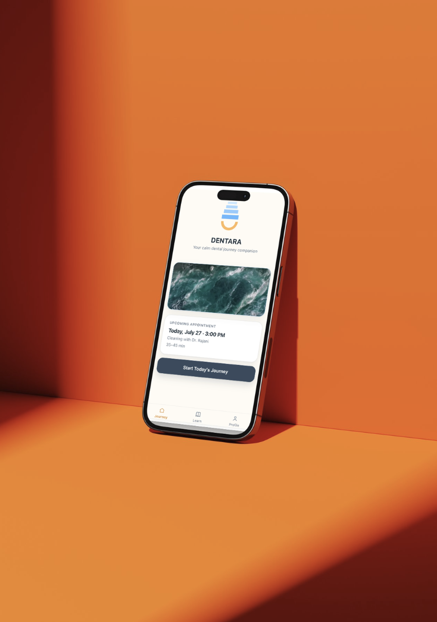
Dentara app mockup

Dentara

Designing a companion that reduces uncertainty throughout the dental visit.

A mobile experience that guides patients through every stage of their appointment with contextual reassurance, helping transform anxiety into confidence.

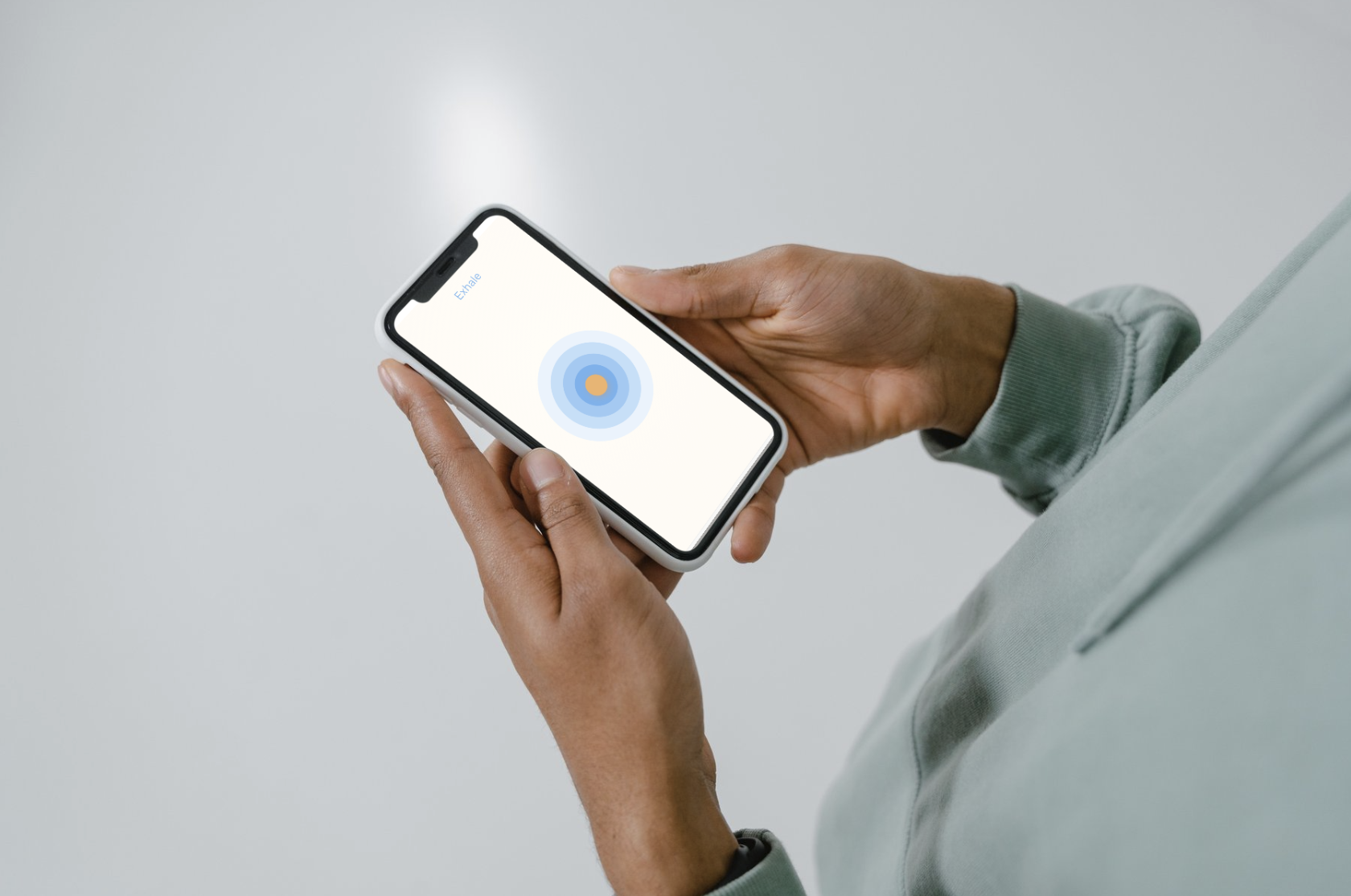
Dentara breathing exercise on phone
Role UX/UI Designer
Timeline 6 Weeks
Team Solo Project
Industry Healthcare
Deliverables UX Research · Product Strategy · Wireframes · Prototype · UI Design
Tools Figma · Claude Code · Photoshop · Canva · AI

01

The Challenge

Millions of people delay dental care due to anxiety. Existing solutions focus on relaxation techniques or education but rarely support patients during the appointment itself.

Opportunity. Design a digital companion that helps patients understand what is happening, what comes next, and feel supported throughout their visit.
02

Research & Discovery

Research Methods

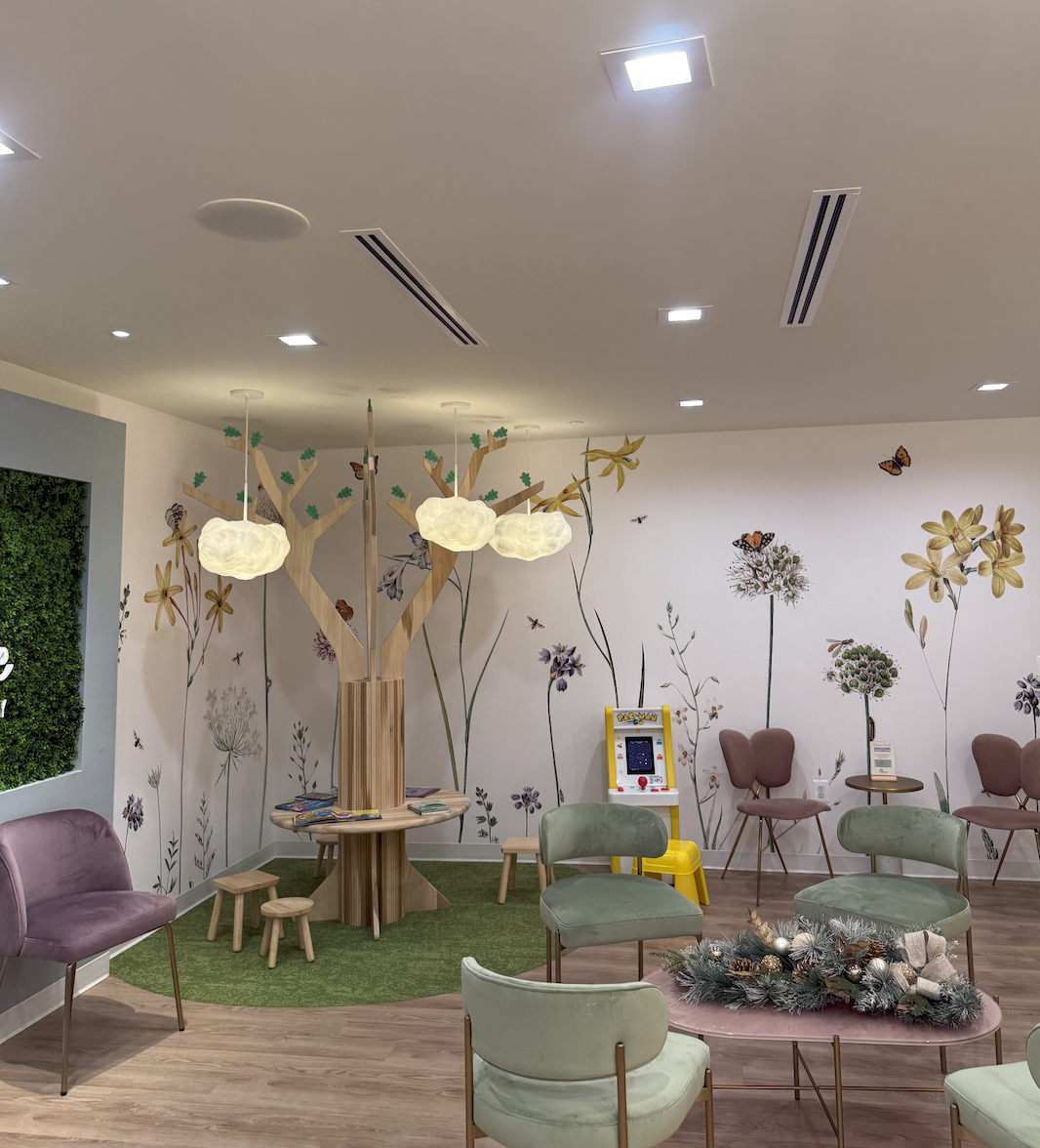
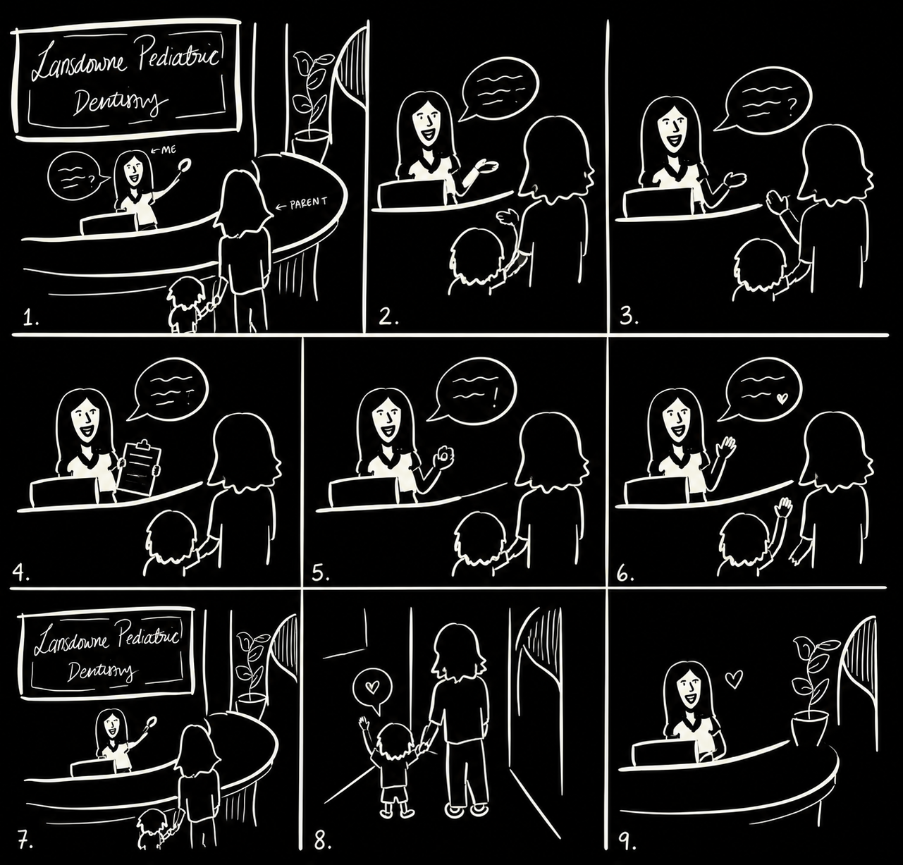
01 Interviewed patients and parents in a pediatric dental office.
02 Observed waiting room interactions.
03 Reviewed existing dental anxiety solutions.

Key Insight. Patients weren't afraid of the procedure — they were afraid of the unknown.

What I Learned

01 Waiting creates the highest anxiety.
02 Patients want to know what happens next.
03 Simple reassurance builds confidence.
Pediatric dental office waiting room
Illustration of interviewing patients and parents

Left: the waiting room where it all started, at Lansdowne Pediatric Dentistry. Right: an illustration of the interviews I conducted in that waiting room.

03

Defining the Experience

Design Principles

Reduce uncertainty before reducing anxiety.
Keep users oriented throughout their visit.
Minimize cognitive load.
Provide support only when needed.

Product Decision. Instead of designing multiple disconnected screens, I created one persistent journey that evolves throughout the appointment.

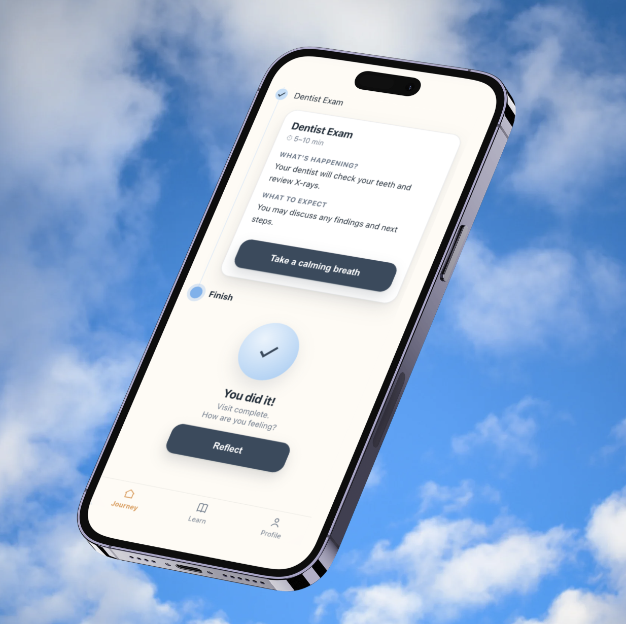
Dentara persistent journey mockup

04

Exploration

I explored multiple interaction models before selecting the final experience.

Separate screens for each stage → too much navigation.
AI chat companion → increased cognitive load during stressful moments.
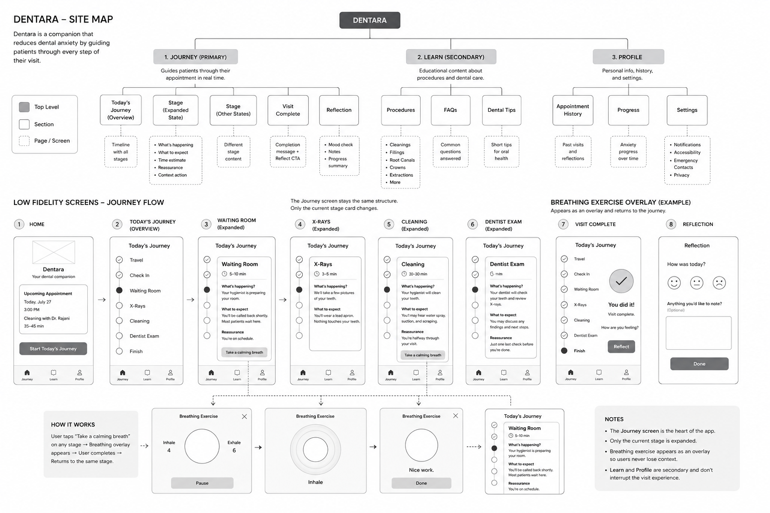
Persistent Journey (Final Direction) → one evolving interface with contextual guidance.

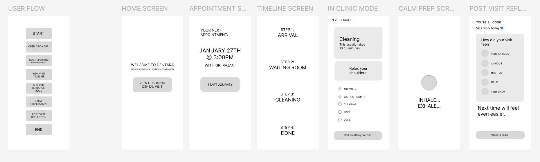
Prototype. Built low-fidelity screens in Figma, then used Claude Code to prototype interactions and AI tools to stress-test navigation before moving into high-fidelity design.

Dentara original low-fidelity wireframes

Dentara site map and low-fidelity screen flow

05

Visual Design

Design System. The interface was designed to feel calm, trustworthy, and approachable through:

Palette

Soft clinical palette
Calm, not sterile

Layout

Spacious layouts
Room to breathe

Components

Rounded components
Consistent timeline patterns

Typography

Accessible typography
Legible under stress

Dentara brand identity, colors, typography and UI kit

06

Final Solution

Journey. A persistent timeline keeps patients oriented while showing where they are, what's happening now, and what's next.

Contextual Support. Breathing exercises appear as lightweight overlays that can be accessed anytime without interrupting the journey.

Reflection. After each visit, patients can reflect on their experience and build confidence over time.

Try It Yourself

Below is the actual clickable prototype, not a video. Tap through the splash screen, open today's journey, expand a step to see its reassurance content, and try the guided breathing exercise before your visit.

Note

Try the breathing exercise yourself through all 3 cycles of inhaling and exhaling. In the real product, there's no button to end it early — that's intentional, to preserve the integrity of the anxiety-reducing, grounding exercise. For the sake of this prototype, though, you can click or tap anywhere to end it early.

Live prototype — tap around, it's fully interactive.

The Persistent Journey, Stage by Stage

Before
the Visit
Waiting
Room
During
Treatment
Recovery &
Aftercare

Stage 01

Before the Visit

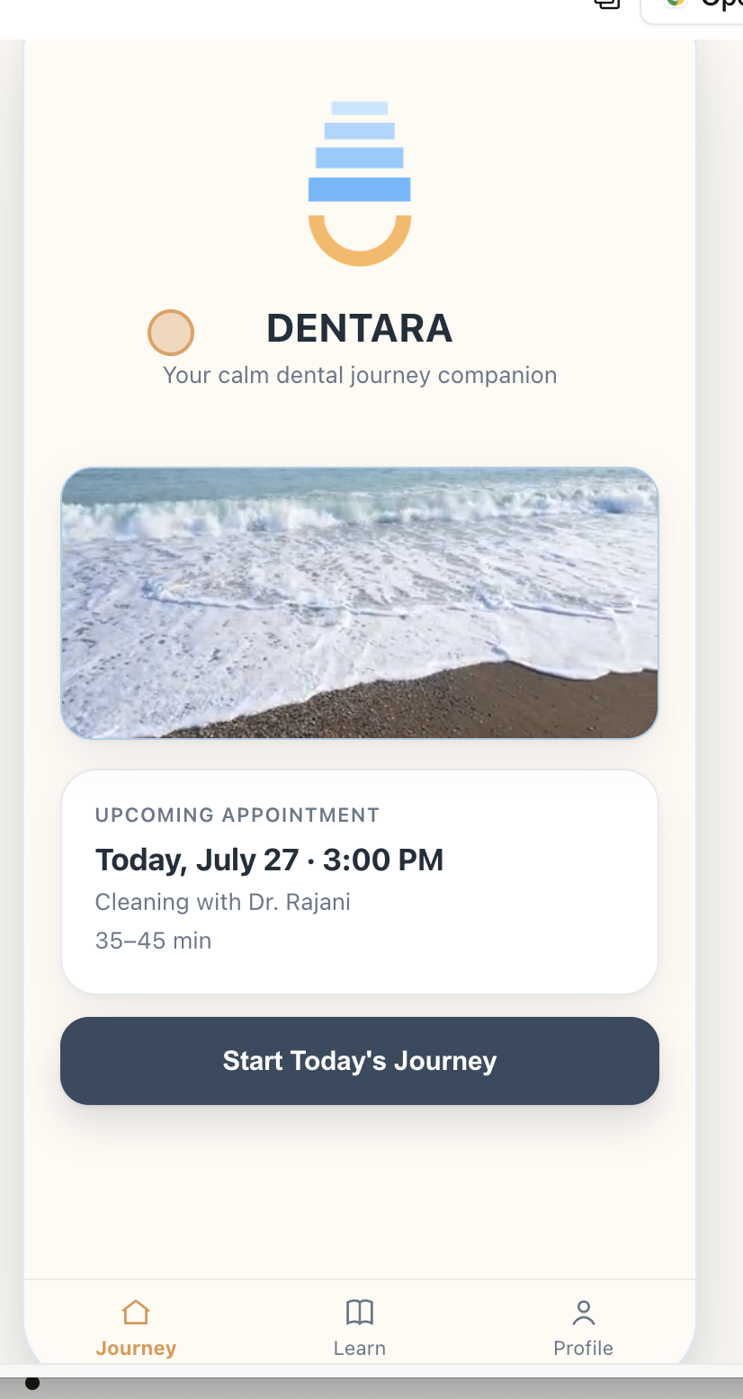
A clear view of the upcoming appointment — who, when, and a single "Start Today's Journey" entry point — replaces the blank uncertainty of an unopened calendar reminder.

Before the Visit screen

07

Challenges & Decisions

Biggest Design Decision

Problem: Multiple screens interrupted the experience.
Decision: Create one evolving journey instead of separate pages.

Another Key Decision

Problem: A dedicated breathing page felt disconnected.
Decision: Turn calming exercises into contextual overlays accessible from any stage.

Tools

01 Figma — UX flows, wireframes, UI.
02 Claude Code — interactive prototype.
03 AI — design critiques & stress testing.
04 Photoshop / Canva — visual assets & presentation.

08

Outcomes

Reduced navigation through a persistent journey.
Prioritized contextual information over information overload.
Designed calming interactions without interrupting the experience.
Created a scalable interaction system that could support future EMR integration.

09

Reflection

Shift in Thinking

This project shifted my thinking from designing screens to designing experiences. I learned that reducing cognitive load isn't about adding more features — it's about presenting the right information at the right moment.

Looking Ahead

If I continued the project, I would explore EMR integration, HIPAA-compliant onboarding, and personalized support based on each patient's appointment and anxiety history.

EMR Integration to skip onboarding:

Appointment scheduled

Patient receives text

"Your dentist invited you
to Dentara."

Open link

Appointment already loaded

Begin Journey

Related Project

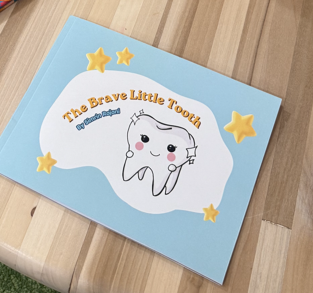
The Brave Little Tooth →
More Projects See all work →