Home Work Play Contact
Trapoola hero

Trapoola

Reimagining a travel brand through a complete visual identity and website redesign.

Trapoola is a travel platform built around authentic itineraries, destination guides, and photography from real experiences. I redesigned the brand from the ground up — creating a new visual identity, logo, design system, and responsive website that makes it easier for travelers to discover destinations and plan their own adventures.

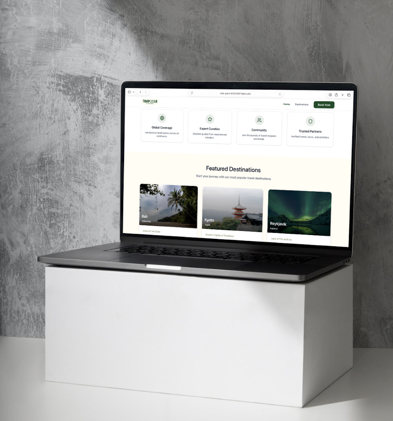
Trapoola brand mockup
Role Brand & Product Designer
Timeline 8 weeks
Industry Travel
Deliverables Brand Identity · Logo Design · UX Research · Website Redesign · Design System · Responsive Website
Tools Figma · Figma Make · Claude Code · Adobe Illustrator

01

The Challenge

Trapoola had valuable travel content and authentic itineraries, but the brand and website didn't reflect the quality of the experience. Navigation made content difficult to explore, and the visual identity lacked a memorable personality.

The goal was to create a cohesive brand and intuitive website that inspires exploration while making trip planning effortless.
02

Research & Discovery

I worked closely with the client to understand their mission, audience, and content strategy while evaluating the existing website experience.

Key Insights

01 Authentic itineraries were the brand's biggest strength.
02 Travelers wanted to browse destinations visually.
03 Navigation made content difficult to discover.
04 The brand lacked a distinctive identity.
05 Photography should lead the storytelling.
Existing Trapoola website

03

Brand Strategy

The new identity was designed to feel adventurous, approachable, and trustworthy.

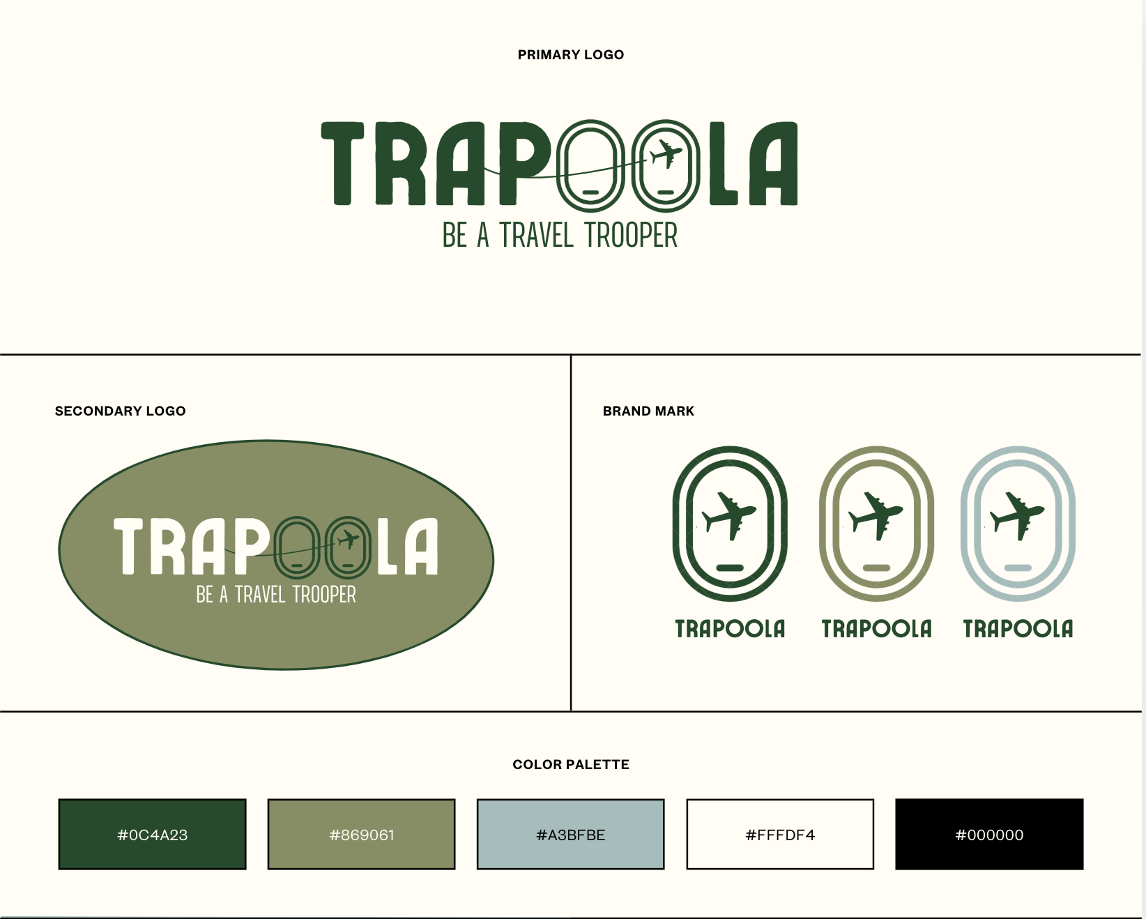
Green became the primary brand color to represent exploration, nature, and new experiences while helping the brand stand apart from the typical blue palettes often used in travel.

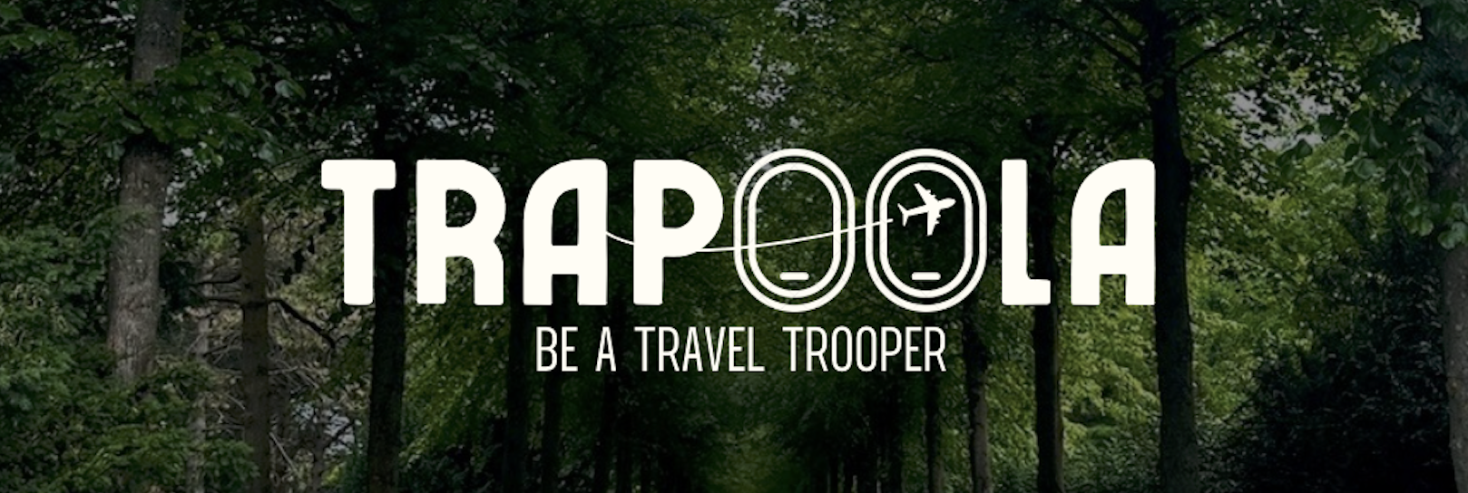
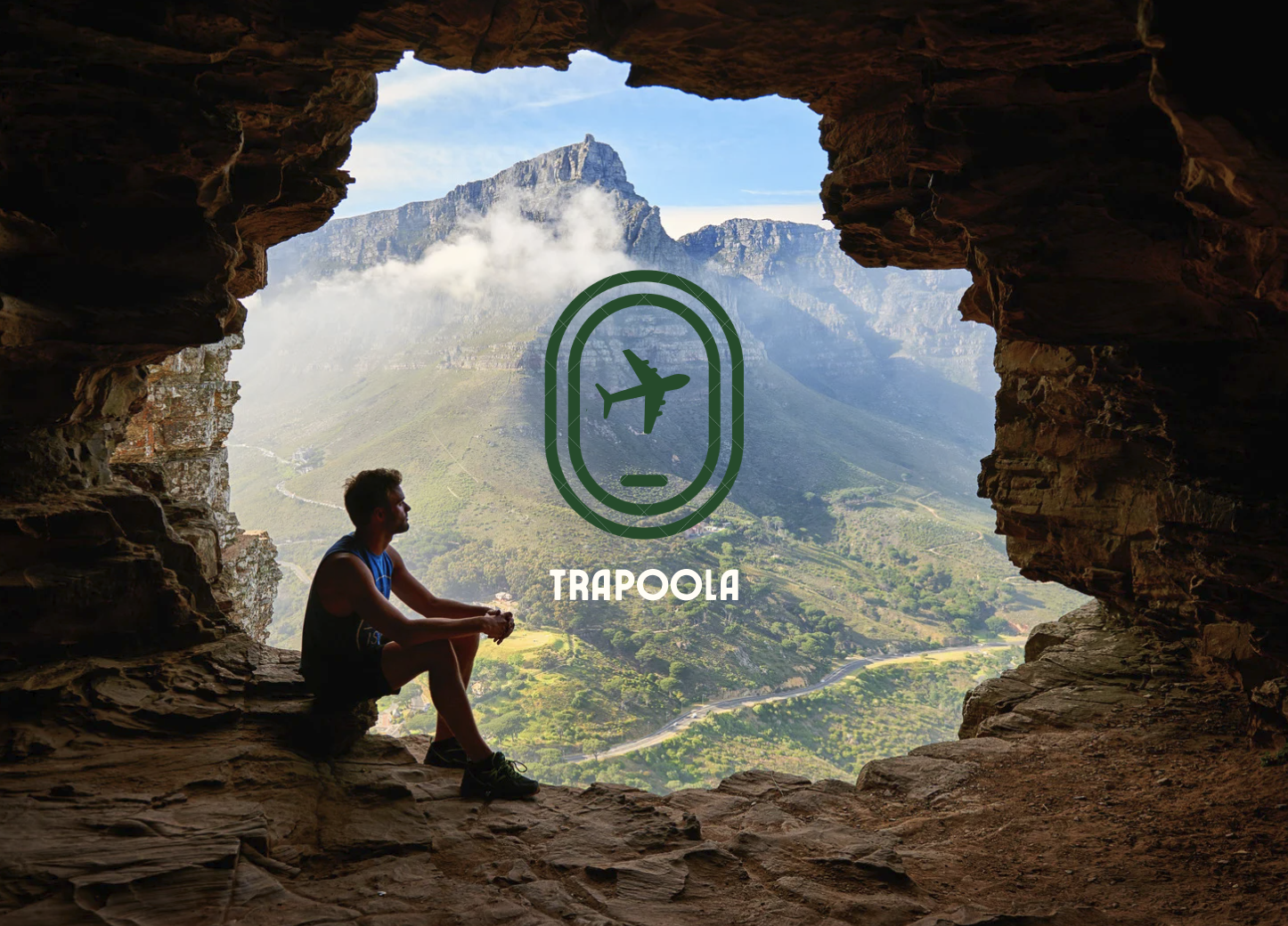
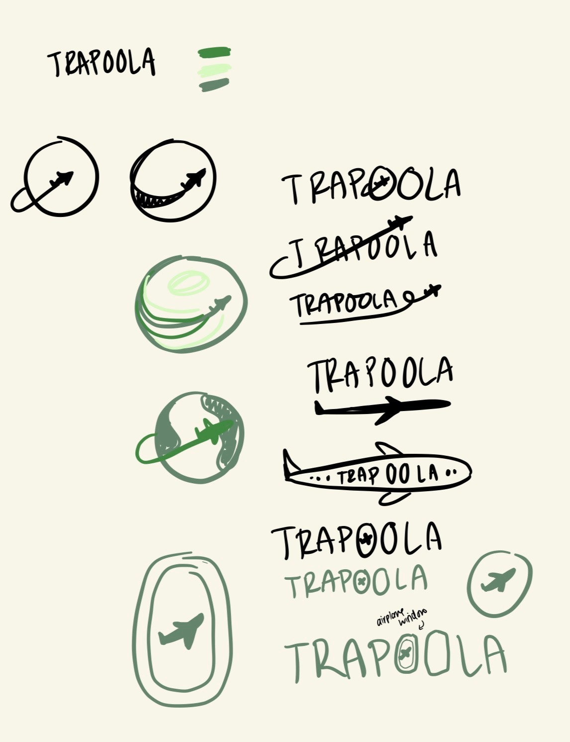
The custom wordmark reinforces the travel theme by transforming the two "O"s in Trapoola into airplane windows, with one window framing a small airplane to subtly communicate movement and adventure.

04

Defining the Experience

The redesign focused on four goals:

Create a memorable travel brand.
Simplify navigation.
Showcase real travel experiences.
Make itinerary planning intuitive.

05

Building the Brand

Before the website took shape, the identity itself had to be built from the ground up — from early logo sketches through to a complete, production-ready design system.

Logo sketches

Logo Sketches

Final brand board 1

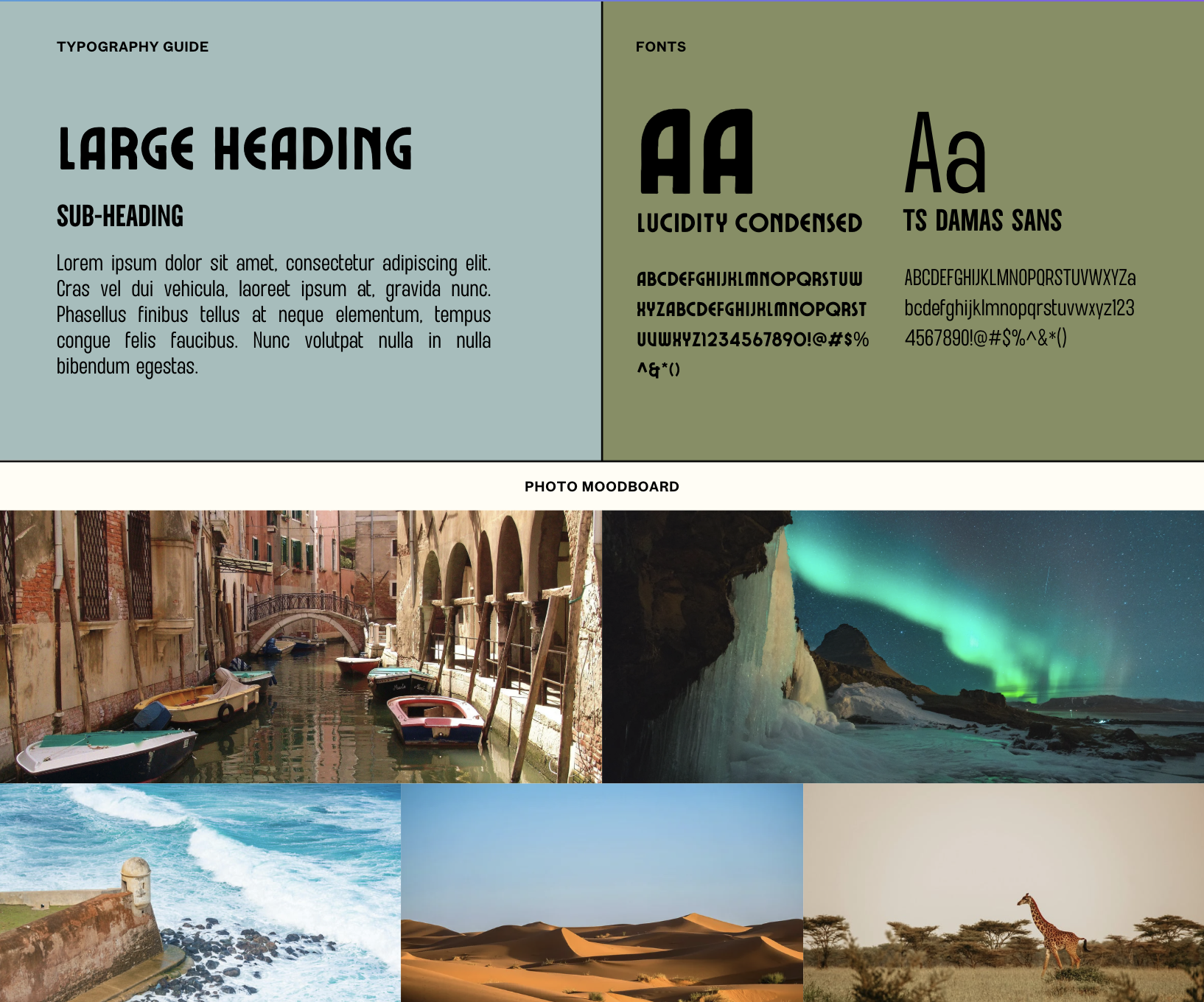
Final Brand Board

Final brand board 2

Final Brand Board

06

Concept Development

I first restructured the website's information architecture before exploring homepage layouts, navigation systems, and reusable UI components.

With the new brand identity established, I designed a flexible design system that carried the visual language consistently across every page.

Destinations page concept

07

Prototyping & Iteration

I designed and refined the experience in Figma before developing the live website using Figma Make and Claude Code.

What I Iterated

Logo concepts Navigation Homepage hierarchy Destination cards Responsive layouts

08

Visual Design

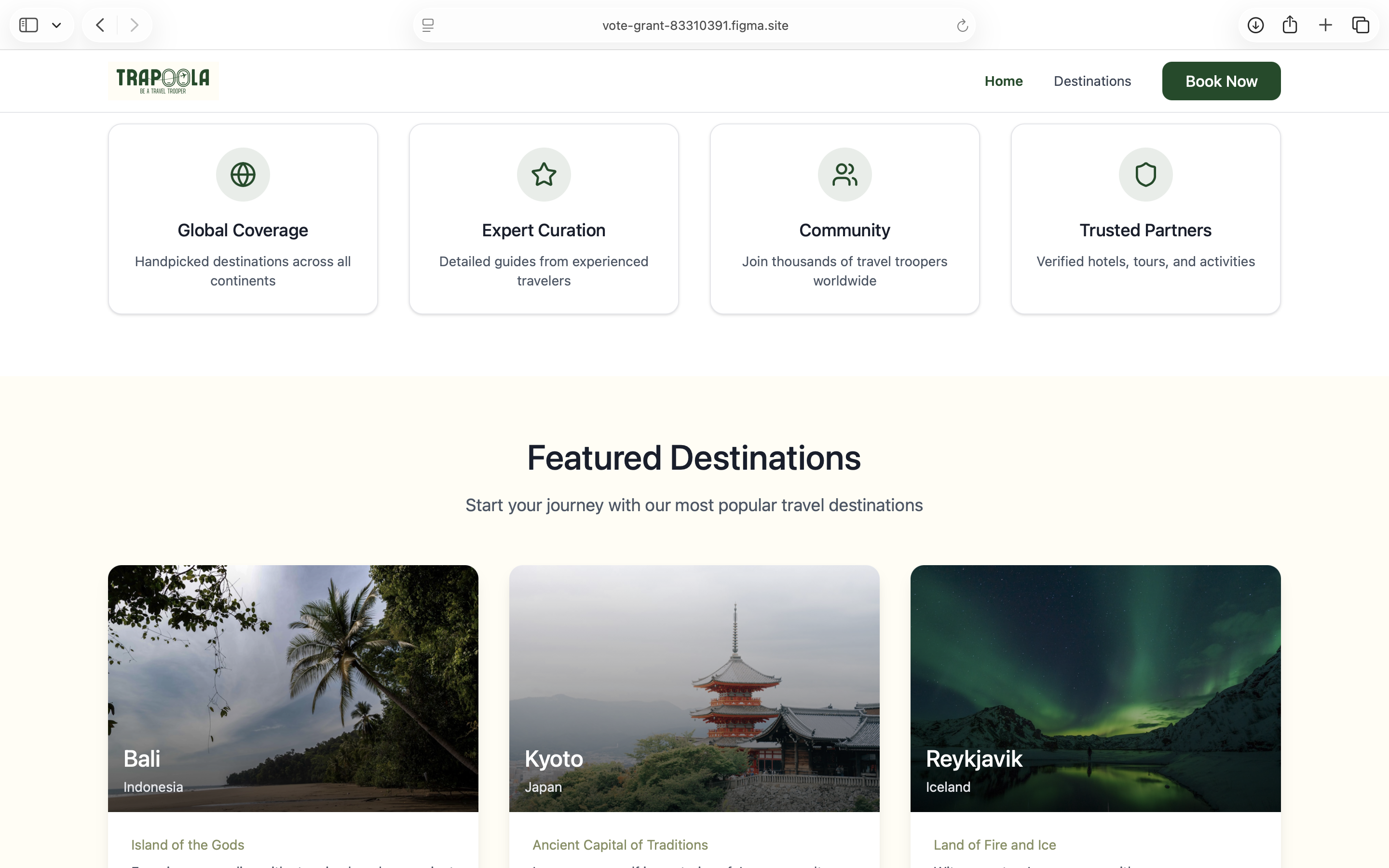
The redesign combines editorial photography with a clean interface that lets destinations take center stage. Consistent typography, generous white space, and reusable UI components create a cohesive experience while reinforcing the new brand identity.

09

Final Solution

The result is a fully rebranded travel platform with a custom logo, cohesive design system, intuitive navigation, and a responsive live website that makes exploring real itineraries both inspiring and effortless.

Drag the handle to compare the original website with the redesign.

The final website, live in the browser.

10

Challenges & Decisions

Balancing inspiration with usability

One of the biggest challenges was balancing visual inspiration with usability. I wanted photography to capture users' attention without overwhelming the interface or making content difficult to navigate.

Simplifying without losing richness

By simplifying the navigation, introducing a stronger visual hierarchy, and building a cohesive design system, the website feels both more engaging and easier to use.

11

Outcomes

The redesign transformed Trapoola into a cohesive travel brand with a modern digital experience. The website is now live, giving travelers an intuitive way to explore destinations, discover authentic itineraries, and begin planning their own adventures.

12

Reflection

This project reinforced that branding and UX are inseparable. A strong visual identity builds recognition, but thoughtful navigation and information architecture are what make that identity meaningful in use.

More Projects See all work →